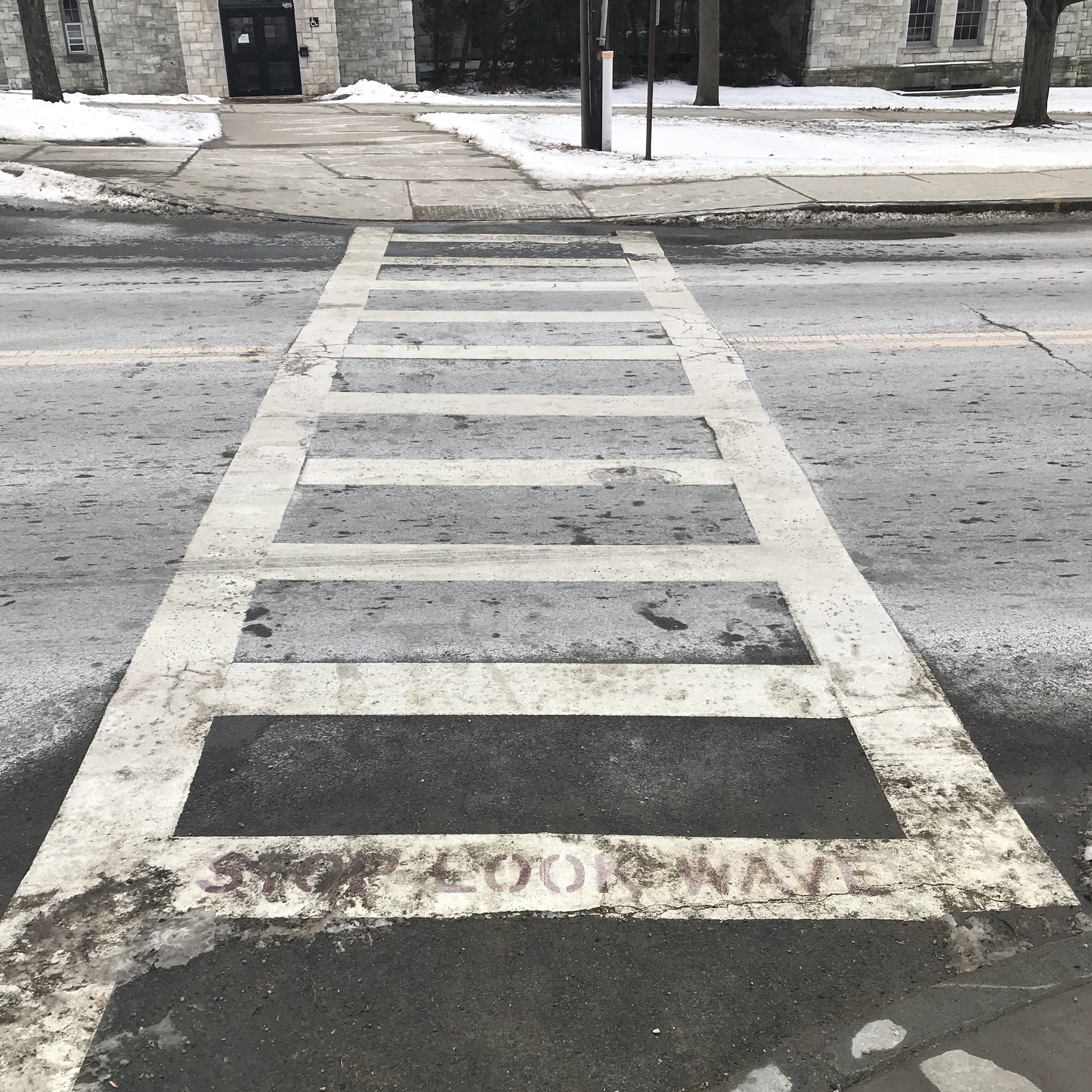
My example of good design at Williams are the crosswalks on Route 2. These crosswalks are an integral part of the campus as they serve as the only ways for students and staff to cross between the two major halves of campus. Because of their importance these crosswalks have been modified from regular crosswalks.
There are two features that I think makes this crosswalk design ‘good’. Firstly, by incorporating parallel side lines running perpendicular to the road users of the crosswalk are encouraged to not cross diagonally across the road. This therefore ensures that people cross the road in the most direct way possible minimizing the amount of time that it takes them to cross - something which is important given how many people cross the road everyday. A second feature which is unique to these crosswalks is the red text which says STOP LOOK WAVE. These words are there as a safety feature, reminding people to look before they cross the road, something which people may do as they cross the road frequently. These words being written in red also makes them stand out (even though they are somewhat faded on the crosswalk pictured above). By having the words stand out people who may be looking down are immediately made aware that they are approaching the road and the danger inherent in that.
Furthermore, by using more white paint than a normal crosswalk the Route 2 crosswalks will be more visible in the dark than other crosswalk another important feature since they are used heavily during all hours of the day and Route 2 can be quite poorly lit. The design of these crosswalks therefore takes into account when the crosswalks are being used.
In Learning to See we read about how “good design is aesthetic”. I would not go so far as to argue that these crosswalks are beautiful, but I would nonetheless argue that they are well designed. I think this argument lies largely in that the crosswalks work well even though they may not be aesthetically beautiful.
To conclude I think it can be said that the Route 2 crosswalks are of good design as they are highly functional and boast features not typically integrated into sidewalks that vastly improves their usability.
