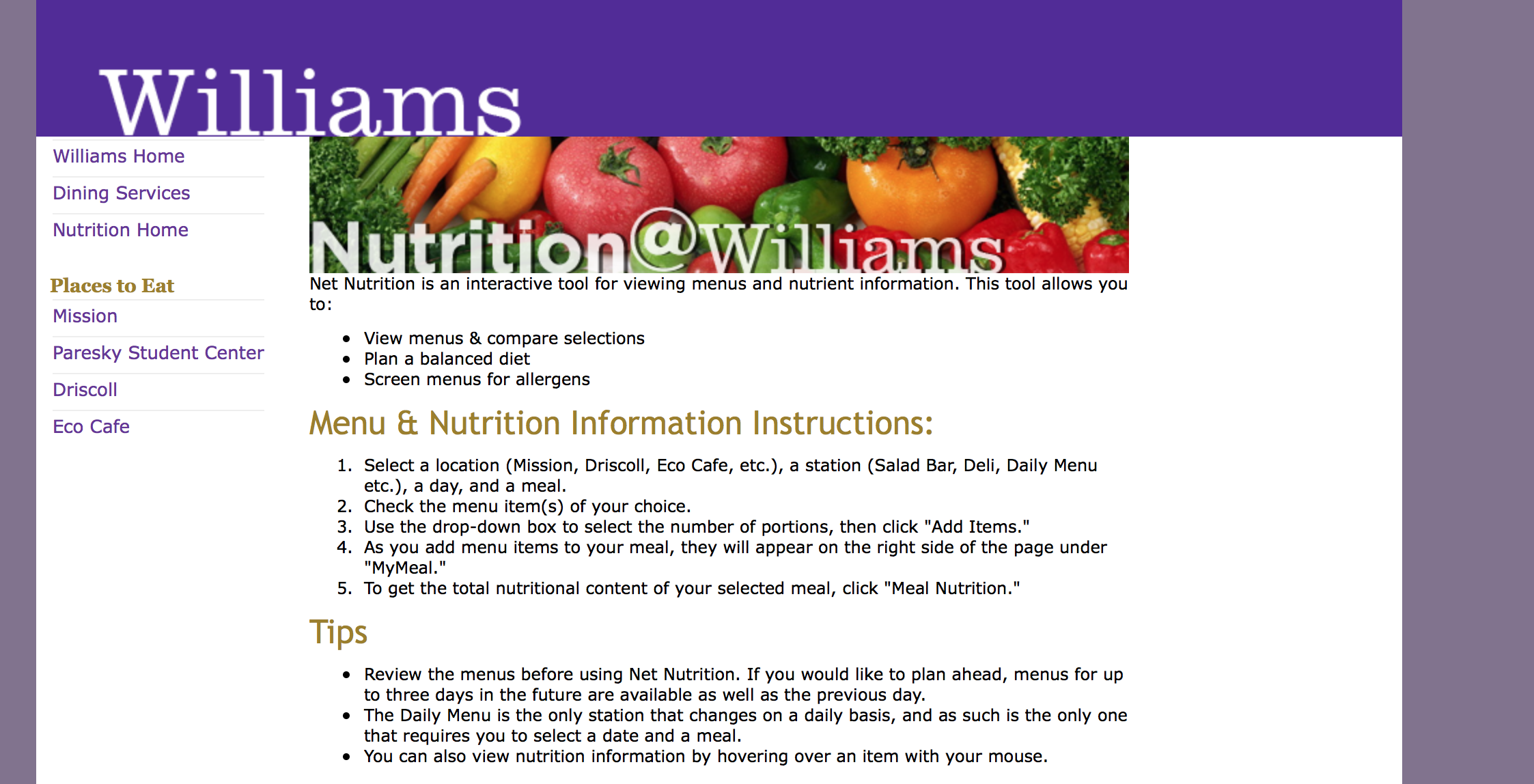
As an example of bad design on the Williams campus I have chosen the dining services’ menu website. The first image below is the nutrition start page.

While this page in and of itself is not terribly designed it is not immediately clear where one is supposed to press in order to access menus. However, after looking around the page and reading the introduction it is clear that you have to select a dining hall in order to see the menus.

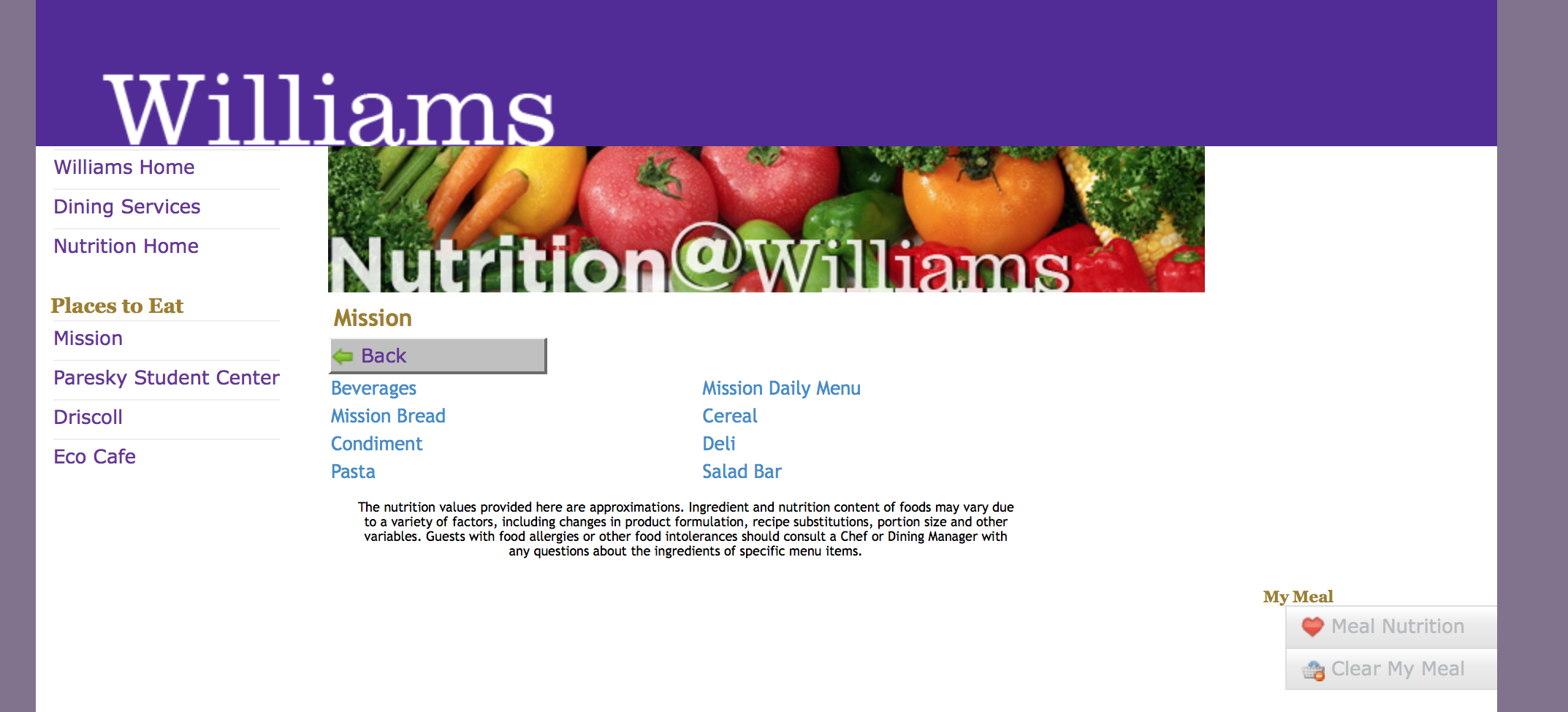
After selecting a dining hall you are brought to this page. Now the issues that I have with this website start to become apparent. The ordering of the options on this page are not logically ordered in any way, they are not alphabetical and not in an order which you would expect (daily menu first, not beverages). A second issue, which will become increasingly apparent is the number of menus one has to click through to get from the start page to a menu (this is particularly true when you want to try to compare menus from different dining halls and will have to go down one rabbit hole of menus, then back up and down another to see the two menus).

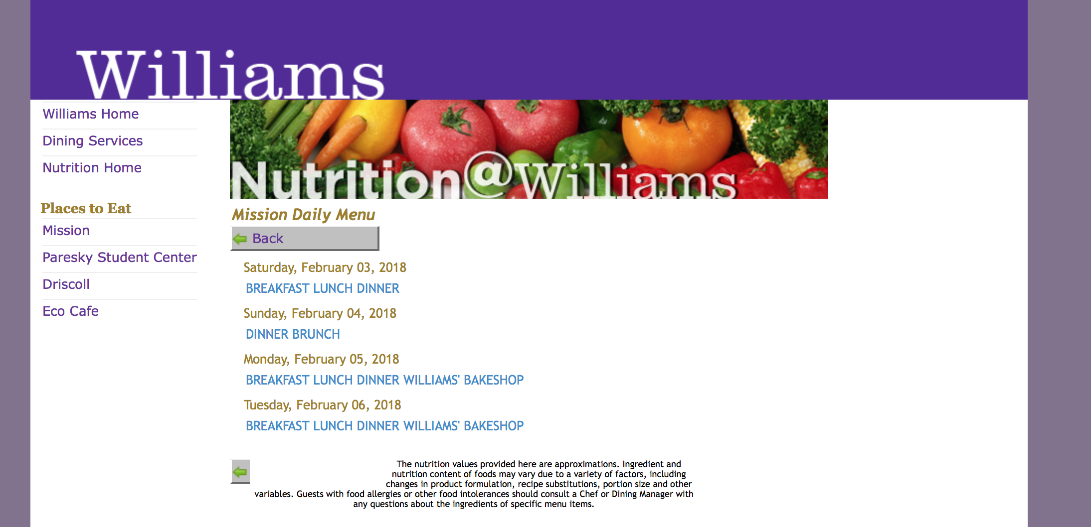
After selecting the daily menu option you are still not brought to the menu, but rather to another page where you can choose which date you are interested in looking at. This further accentuates the number of pages you have to click through to get to the menu itself. There are however further issues with this page. Firstly, the meals are not chronologically ordered for all days (see Sunday, where Brunch follows Dinner), this seems quite nonsensical. Secondly, the lack of spacing between the options makes for an unappealing aesthetic in my opinion.

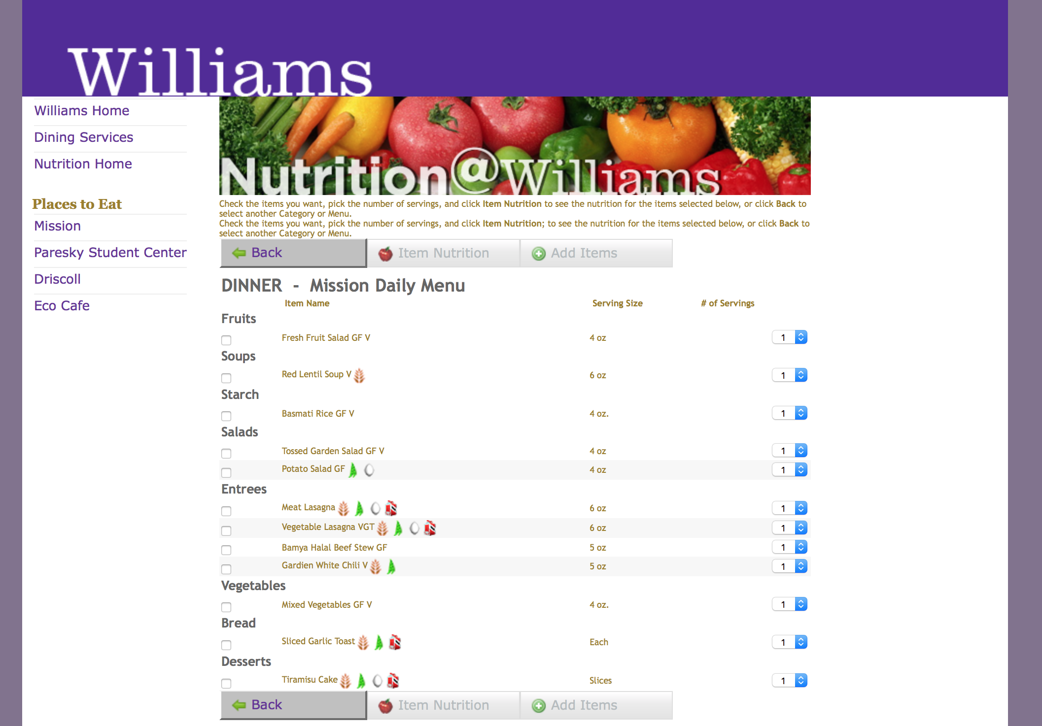
After clicking through all of these pages you finally reach the menu itself. However, the menu is not without faults of its own. The ordering of the items seems random in that it does not start with the main courses but rather with the fruit. The menu is also quite cluttered due to the small font and many icons. I understand that the icons are necessary to communicate allergens but I think this could be better achieved by revealing the icons when holding your pointer over the menu item. In Learning to See we read that designs can be put on a spectrum with the two dimensions of ugly -> pretty and broken -> works. The Williams nutrition page is in my opinion ugly (and I believe many people would agree with that). When it comes to functionality I also think the website performs badly because even though it is possible to find the daily menu it is not a straightforward process. As this design performs badly in both of these dimensions I think it can be said that it is a bad design.
Overall I think the Williams Nutrition is poorly designed for a few reasons. Firstly, it is not immediately clear how to access the menu at first glance. Secondly, in order to reach the menu you need to click through at least 3 pages - this seems excessive. Both of these grievances stem from when it is that people want to use this website. Most people I know use the site to quickly check what is being served in the different dining halls before going out for lunch or dinner. By making the site hard to navigate people will take longer to find the information they want than what would be ideal. Furthermore, this site is used by all members of the Williams community, some of whom may not be very proficient with computers, accesibility should therefore have been an area of focus in the design process, but in this case it seems to not have been. Finally, the pages that you have to click through do not present options in a logical fashion, making navigation even more difficult and time consuming.